29 March 2013
Blendamaze: Delighting users with unique gameplay
Nate Dicken is the owner of Borderleap and the creator of Blendamaze, a Corona App of the Week winner. As an artist and indie developer, Nate writes on creating unique gameplay to delight players of all ages.
 A Solid Foundation
I confess I’m a bit of a perfectionist. I find myself often laboring over that single pixel that’s off or that bit of Lua code I’m trying to perfect. In those early months last year of deciding I wanted to make a game, this drove me to to research, research and research. I wanted every facet of what I built to be the best it could possibly be. Possibly a goal too lofty for my first game, but I needed to dive right in.
What type of game would I build? What games did well? What elements would I need to include in the game? How much would I charge and what monetization methods are most profitable? How do you get ranked in the app stores? How do you get featured? How in the world would I market this thing when I had nearly no connections yet in the industry? Too many questions! I can safely assume that you’ve battled with questions these as well.
As I found, this is an ideal time to take a deep breath and look at the big picture. Towering above these unanswered questions was the comfort of knowing that if I created something original, made it look great, and added a solid user experience behind it, there was a good chance it could do really well. The foundation to any successful app is its quality.
The Importance of a Unique Idea
With my love of drawing and painting, I’d been contemplating the idea to create a color-theory game. Digging around the App Store I confirmed this was a good space to be building a game and there was the possibility of creating something really unique and special.
In its early stages, Blendamaze was actually called “Blender” and was a block-style game where you had to work with colors and “blend” them together to solve puzzles. This seemed a bit too much like other games out there such as Tetris, so I desired to have a more unique aspect to the gameplay. I would often ask during this brainstorming stage, “Why would anyone want to buy this?” Focusing on the end user is critical.
When I was a kid, I had one of those original wooden labyrinth marble games that we’d often play. If you’ve ever played, you know they are quite fun – and difficult!
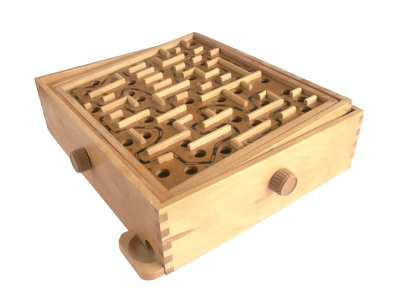
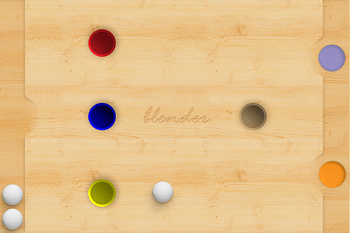
Last spring, I came across it in storage and memories of playing the labyrinth game began to mix with ideas of how I could combine it with a color theory component. Bingo! This was it – the unique recipe I needed for a unique game. The idea was born – using a marble to blend colors together with the intention of matching a specific target color. This was an early concept I had for the game before the “maze” component began to really take shape. As you can see in this version, there was multiple marbles per level…
Polishing the Idea
I put significant thought into the details of Blendamaze. Solid user experience is so critical to creating a successful game or app that people enjoy. Building on the foundation of creating a quality game that people would hopefully love, I knew the design needed to be attractive, yet clean and simple.
As the idea evolved, so did its complexity. With so many components blended together, my fear was that players might get lost in the experience. As we all know, and experience, ourselves with games and apps, if it’s complicated or looses our attention, we’re done with it quickly.
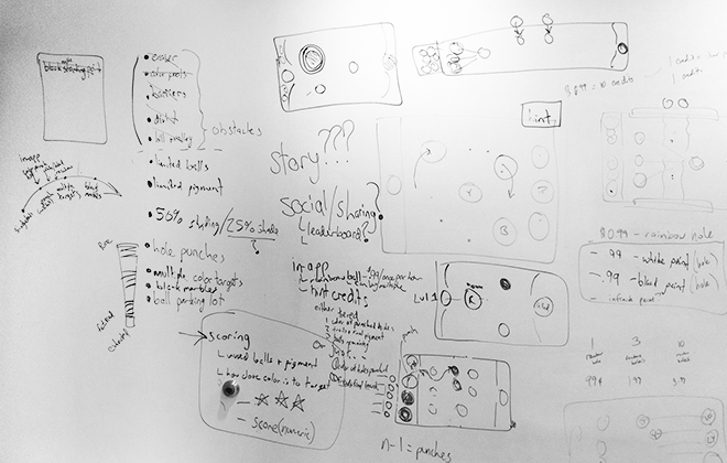
So many factors to consider! Obstacles, level creation, storyline, social sharing, scoring, achievements, and more. During this process it’s important to simplify and get to the root of the idea. As hard as it is, an app or game can be made much stronger if features that don’t positively contribute to the core purpose are cut.
Consider the value of this for your next app or game. A web studio that’s often inspired me is 37Signals, creators of Basecamp project management software. They’d often share that right before launch day, they’d nix entire features or sections. Why? Because doing this strengthened the user experience as well as remaining features, while simplifying the product.
For Blendamaze, I’d considered numerous changes, especially changes to the storyline and character as well as the crazy obstacles. These seemed to detract from the simplicity of blending paint colors. The reviews have confirmed that users enjoy the balance between the blend of maze and paint.
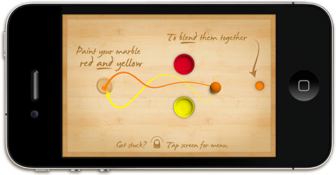
You should ask yourself these questions: “How would the end user like the game?” and “Would they find it enjoyable and easy to understand?” These questions led me to wonder how I would teach the user to play Blendamaze. One way that has proved successful has been to bake instructions right into the actual gameboard. I integrated instructions into the first few levels on the board itself, enabling people to learn the rules while actually playing.
Consistency is Key…
Consistency is important to consider for any game you create. Take a step back and think of how all the elements tie together aesthetically and functionally. I wanted every aspect of the game to look real. This focus on consistency guided every decision around design and user experience. Subtle shadows and bold, diminishing paint streaks that appear after paint splatter, helped portray this level of realism. Fine-tuned physics even dictated how the marble would interact with the board and paint holes. Additional code needed to be written to enable something as simple as applying force to the ball as it nears a paint hole. Custom sound effects were created by programmatically altering sound pitch to create the effects of playing a physical labyrinth board. This all required extra time but was well worth it.
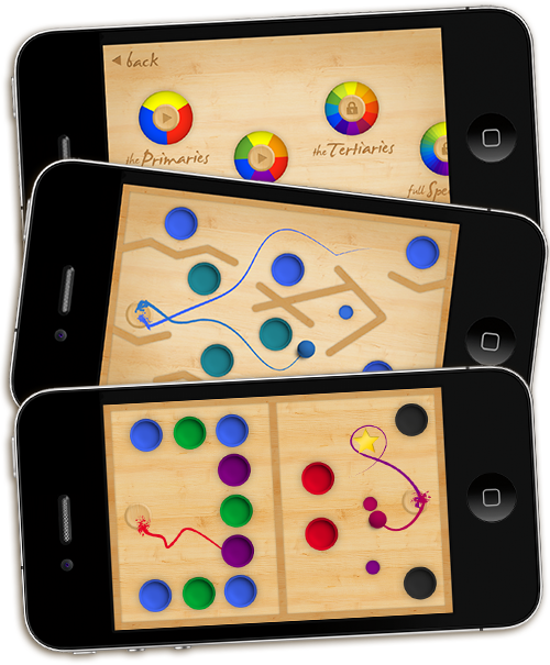
All the details came together to become a beautiful, yet challenging puzzle game that both adults and children enjoy. This has been a huge appeal as the color theory aspect is educational for children yet the game gets tough at later levels for older kids and adults. My desire to release a game with unique gameplay and with wide appeal has been taken quite well by fans! The reviews in the App Store have been truly humbling and I’m happy to see people who really love the game and who share it with friends. For your next game, I encourage you to seek out that unique aspect for your game or app. Develop, refine and polish the idea and build a solid user experience around it. Never sacrifice on quality and you’ll have a solid foundation to do well!
Getting in touch…
I look forward to connecting with more folks in the Corona community and working with mobile designers and developers on future projects. Please don’t hesitate to get in touch!
Nate Dicken
http://borderleap.com
http://twitter.com/borderleap
[email protected]
http://twitter.com/natedicken
http://www.linkedin.com/in/natedicken/
BorderLeap is a mobile game/app studio that was founded in 2012 by Nate Dicken, a veteran of the web industry with over 15 years of design, UX and development experience. Keep an eye out for new apps and games by BorderLeap, including new features and levels for Blendamaze! You can view more info about Blendamaze at http://blendamaze.com and grab your free copy in the App Store at https://itunes.apple.com/us/app/blendamaze/id546937504?mt=8&uo=4


Sorry, the comment form is closed at this time.